GENERAL TECHNOLOGICAL REQUIREMENTS
General technological requirements
- Setting Bleed
- Setting Crop Marks – Use of other printer’s marks
- Page order, page layout
- Marking Cut-lines
- Resolution of image files
- Distances from cuting and folding
- Embedding fonts
- Usage of black ink and overprint settings
- Minimum line thicknesses
- Gradients and moiré
- Barcodes
Setting Bleed:
Minimal movement must always be taken into account during printing production. This can be compensated for by using bleed, which means continuing the graphic beyond the cut line. The amount and setting of the required bleed is different for different products.
- For general publications (book, booklet, flyer, poster, etc.) the bleed should be 3 mm.
- For coil bound publications, a bleed must be made on all four sides.
- For perfect bound and staple bound publications and books, it is not necessary to make a bleed on the binding side.
- For laminated board, 17.5 mm from the gray plate.
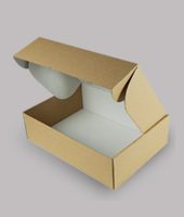
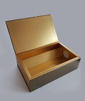
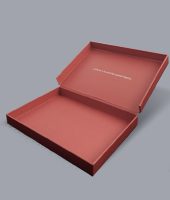
- 3 mm for cardboard boxes.
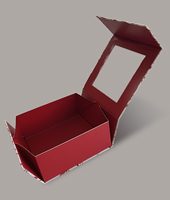
- 5mm for boxes laminated to corrugated cardboard.
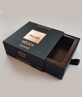
- 7mm for double-sided lamination.
Setting Crop Marks – Use of other printer’s marks:
- The crop marks must be placed at least 3 mm from the cutting line.
- The thickness of the crop marks [Weight] should be 0.125 pt.
- Please omit all other printing marks: Registration Marks, Color Bar, Bleed Marks. Their inclusion is unnecessary and sometimes confusing.
Page order, page layout:
- The pages of the PDF are requested in the same order as the page numbers of the publication, per separate page and in one PDF file (eg: books, perfect or staple bound publications).
- For cover pages or leaflets, please combine the pages together. For a cover, this means that the cover (1st page) and back of the cover (4th page of cover) and the spine are on a single PDF page.
- If the product has only two pages, the first page of the PDF contains the graphics of the outside, the second the graphics of the inside (eg: boxes, postcards, combined cover pages).
Marking Cut-lines
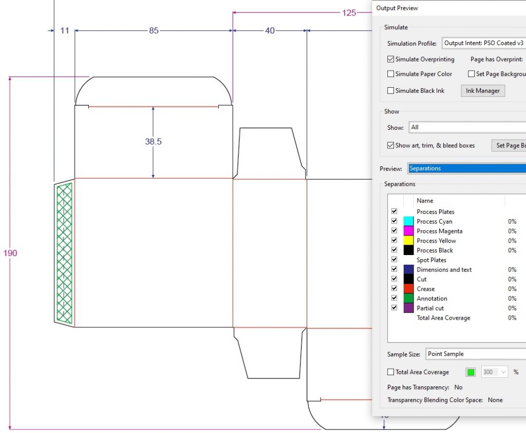
In the case of boxes or other punched publications, please mark the Cut-lines in the PDF file with an overprinted vector line, colored with custom named spot colors.
The names of the chosen spot colors should be precise (eg Cut, Crease). It is practical to use the same spot color markings which are used in the PDF you received from our box design department.
Resolution of image files
Generally, the resolution of bitmap files (images) intended for printing use should be a minimum of 300 dpi (or ppi) and a maximum of 500 dpi. At low resolutions, the print will appear pixelated. Unreasonably high-resolution images do not affect print quality, but they do increase the file size unnecessarily, which can slow down the processing of files.
The optimum resolution is dependent on the type and resolution of the screening method used to create the printing plates. In our printing house, we usually use classic halftone screening at 70 or 80 lines per cm (175 lpi and 200 lpi, respectively). The rule of tumb dictates at least 1.5 x line screen resolution as the minimum requirement and 2 x line screen resolution as optimal.
When printing high quality images (eg art publications, photo albums, etc.), it is recommended to use Hybrid screening (with 250 lpi resolution). This results in a more detailed, photo-like print. To take advantage of the technology, the resolution of the images must be between 375 dpi and 500 dpi. When using Hybrid screening, artifacts from low resolution images will be more visible than with classical screening methods, so special attention must be paid to the quality of the images.
Distances from cutting and folding
Due to the minimal movement during printing production, care must be taken when designing graphics that text or other non-bleeding graphic elements do not get too close to the cut or fold lines. Safe distances vary from product to product.
- For publications (book, booklet, flyer, poster, etc.) 2-3 mm.
- For laminated board cover, the safe distance from the gray plate is 3-5 mm.
- 2-3 mm for cardboard boxes.
- 3-5 mm for boxes laminated to corrugated cardboard.
Embedding fonts
The fonts in the printed PDF file must be embedded. Failing this, the fonts will be replaced, meaning they will look different. If embedding is not possible, glyphs are often converted to outlines as an alternative. This can lead to a significant increase in the size of the PDF file, which can in turn slow down the file processing.
Usage of black ink and overprint settings
Thin texts, lines
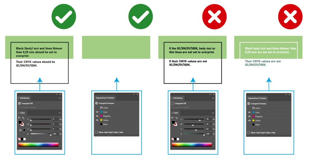
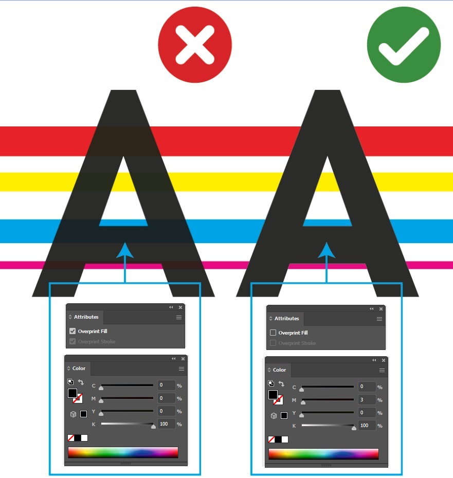
Black body text, lines thinner than 0.25 mm must be set to overprint. Their CMYK composition should always be 0C/0M/0Y/100K for sharper type contours.
Large black areas
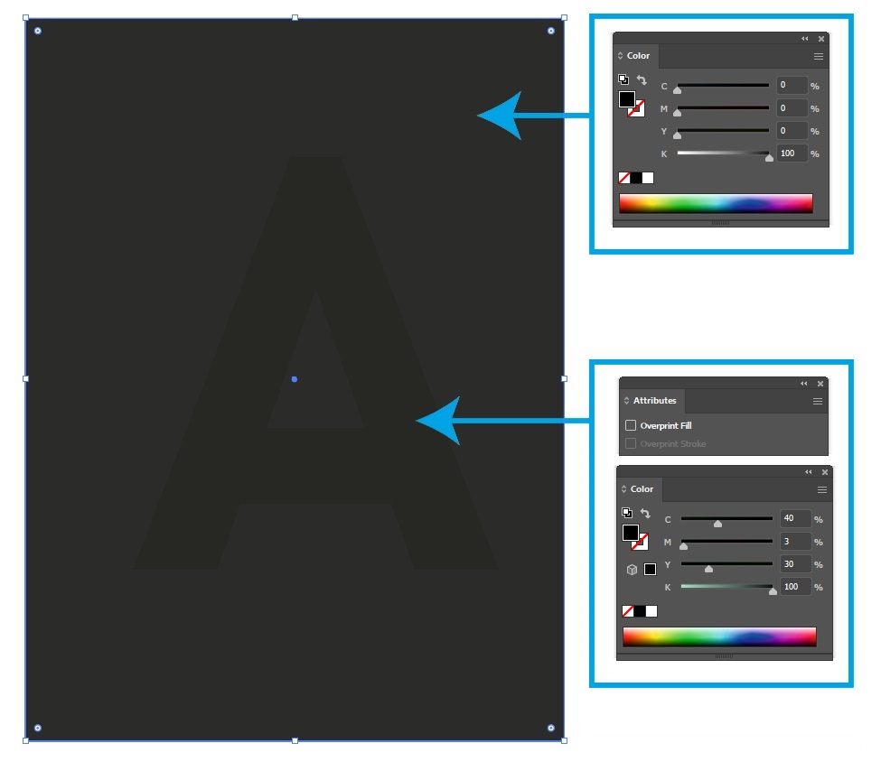
Larger black elements with a composition of 0C/0M/0Y/100K must be set to knock out if your intention is to appear as a uniform color over the entire area. If a black surface with a larger surface area is set to overprint and cyan, magenta, yellow are not evenly present below it, then black will not be uniform.
„Rich Black”
The recommended black setting known as “rich black” is as follows: 40C/30M/30Y/100K. It is usually used to print larger deep black areas. In the case of thin graphic elements, lines, body text, its use should be avoided for technical and practical reasons: on small surfaces, the eye is unable to differentiate blacks with different CMYK compositions, but the small missregistration during printing (which is unaviodable) will cause coloring on the edges.
Minimum line thickness
When designing the graphic, it must be taken into account that the applied line thicknesses correspond to the minimum values that can be safely produced with the given production technology.
- Minimum line thickness that can be safely printed with offset technology: 0,025 mm.
- Traditionaly screened or flexo cliché form for UV varnish: 0.025 mm.
- Hybrid effect varnishes:
- Hybrid “fine” effect varnish: 0.4 mm.
- Hybrid “rough” effect varnish: 0.8 mm.
- 3D MGI UV varnish
- 0.14 mm for a thickness of 7µm.
- 0.3 mm for a thickness of 42 µm.
- 3D MGI UV varnish and foil:
- Varnished sheet: Positive: 0.2 mm, Negative: 0.4 mm.
- On foiled sheet: Positive: 0.4 mm, Negative: 0.7 mm.
- Foil blocking: Positive: 0.2 mm, Negative: 0.3 mm.
- Embossing: should be thicker than the thickness of the base material.
- Coldfoil:
- 0.15 mm for non-overprinted graphics.
- For overprinted graphics, it is the same as the printable line thickness (0,025 mm).
Gradients and moiré patterns
Gradient is a popular motif among graphic designers. However, improper graphic editing can easily lead to a non-gradual, stepped transition. This is most likely to occur if there is only a small change of color over a long surface or if it contains only one primary color (e.g., black but not cyan magenta yellow).
There may be several reasons for the formation of moiré pattern (screen interference): 5th spot color using halftones, improperly descreened photos scanned from a print (typically archive), screening of a regularly textured surface (fabric, fishing-net). The formation of these undesirable effects can be somewhat lessened by refining the screening resolution or by choosing the least critical screening angle. This is an unaviodable physical phenomenon and although we can often reduce it (by trial and error), but we can’t completely eliminate it.
The formation of a stepped gradient and moiré pattern cannot be predicted in all cases. The screening problems are not visible on the ink-jet contract proof either. When preparing the job for production, we only have the opportunity to draw attention to the existing risk. Therefore, caution should be exercised when editing graphics.
Barcodes
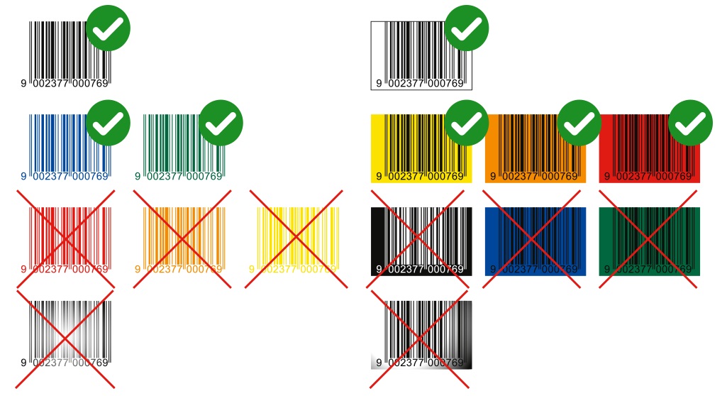
Ideally, barcodes should be 100% Black (0C/0M/0Y/100K) or some very dark spot color. The background should be white or some light color. Avoid translucent and metallized backgrounds. Please always use vector graphics, and avoid the use of bitmap images. These rules must be followed to make the barcodes readable.
